Mobile is taking over! Increase Your Font Size.
The internet is constantly changing and the mobile vs. desktop discussion is one of the most relevant topics to pay attention to as a blogger today.
The key thing to note is mobile is overtaking desktop!
Why should you be paying attention to this fact? Because this doesn’t just affect users and how they consume content, interact socially or shop, it also has bearing on how marketing dollars by brands are spent and Google search ranking results.
It’s a well-known fact that mobile devices provide an easier internet on-the-go solution.
It’s also a well-known fact that Google cares heavily about the user’s experience. With the rise of mobile device usage, Google’s been directing some new changes – changes you need to be aware of!
But first, you should know why these changes are happening*:
- 51% of the time spent online in the U.S. is on mobile devices
- Nearly 80% of internet usage is expected to have been mobile in 2018
- 40% of people search only on a smartphone
- More than half of all video views come from mobile devices
- Phone based CPCs (cost per clicks) cost 24% less than desktop and have a 40% higher CTR (click through rate)
- Online shopping on mobile increased from 8% to 15%, while on desktop dropped from 78% to 63%
In the past couple of years, more and more people have started reading blog posts and viewing their favorite social media platforms from a mobile device.
The most recent data, from my clients (who heavily promote their blogs via Instagram), are coming back with an average around 80% of users are viewing their sites on a mobile!
The key thing to note: If you’re a blogger, wanting to make money online, it’s important to improve your website’s mobile user experience!!!
And one of the simplest, fastest and most effective things you can do to improve your website’s user experience, SEO (search engine optimization) and RPM (revenue per 1,000 impressions) today is to…
Increase your font size!
Increasing your font size should require one easy change to your theme’s settings page, or a few adjustments to your stylesheet, in order to make this site-wide improvement.
Depending on your theme, there are five most common units of font size measurement:
- point (pt)
- pixels (px)
- em
- rem
- percentages
You’re probably familiar with the first two on this list. If your theme uses one of these, it’s a lot easier to provide you with a size recommendation.
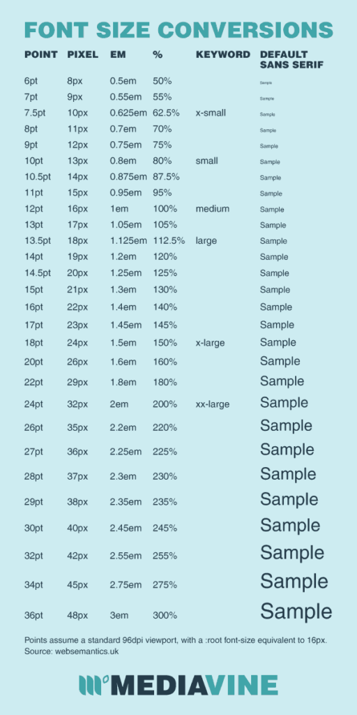
This font size conversion chart by MediaVine might help as well. Note: You can use the following conversion chart as a “rough estimate,” but remember that devices, user settings, fonts, themes and parts of your stylesheet can impact all of these:
So— with all of that said, what font sizes are best for boosting SEO and RPM?
Google recently started recommending 16px as a base font of a site. That means the main text of your font should be set to 16px minimum.
So for SEO, you need a minimum of a 16px font to make sure your site is considered mobile friendly, which is crucial in the mobile-first index.
I have to say, some people (like Mediavine) are recommending a little bit bigger with an 18px size.
I hear ya! This may sound like a big number on a desktop (especially since we’re not used to it), but remember which device your audience is mainly reading from, and that it’s not an 18pt font; 18px is actually still pretty small on a mobile device.
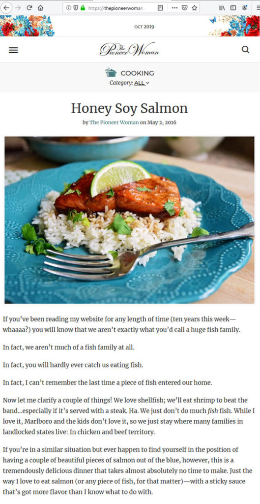
Here’s a few real life examples to go check out their blog post body font (on a desktop AND mobile):
Your Marketing BFF (17px)
The Pioneer Woman (22px)

Pinch of Yum (17px)


It never hurts to experiment with your font sizes and see which looks best, as long as you remember that 16px needs to be the absolute minimum!
How do you make these changes? Here’s 3 options:
Option 1: If you want to do it yourself and your theme has customization options (APPEARANCE > CUSTOMIZE > ADDITIONAL CSS), dropping in a little CSS here is the easy way.
Here’s a little CSS to adjust your body size and H1 (header tags):
body {
font-size : 17px;
}
h1 {
font-size : 24px;
}
Option 2: Email your theme creator, as they’re likely the best source of information and advice on how to increase your font size within that particular theme.
Option 3: We can also do it for you (cost: $45). Just send us an email and we’ll get it done.
KEY TAKEAWAYS FROM MOBILE vs. DESKTOP STATISTICS 2019*
- More than half of the internet traffic worldwide is driven through mobile devices, with current trends indicating mobile share to further increase to as high as 80%.
- This trend is not limited to any one segment of the internet. Search volumes, social media network access, ecommerce revenues, all show a continuous shift towards mobile.
- It’s important that bloggers have a clearly defined strategy for mobile users. Merely making your website responsive for smartphones and tablets is not going to be enough.
- Users demand a mobile-optimized experience, and your SEO and content strategy will have to reflect this if you want to be on the winning side of the mobile user experience!
Now that mobile is taking over! Are you ready to increase your font size so that you’re meeting the latest requirements??? I have, and so should you!

Hi Tana,
Where can I find info on what font my theme is using currently? Thanks!