12+ Logo Design Trends of 2014 – 2015
If you’re in the process of changing your logo design, or planning a re-fresh of your existing brand for your business, then you’ll love today’s post!
We’re showcasing some of the 2014-2015 top trends for business logos.
Typography based.

Incomplete logo concept.
Free-Flowing and hand-drawn sketches.
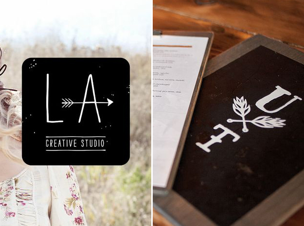
Letter stacks.
Motif with a recurring pattern or shape in the design.
Transparent overlays.
Bold statements and colors.
Crests and subtle texture of letters.
Black and white.
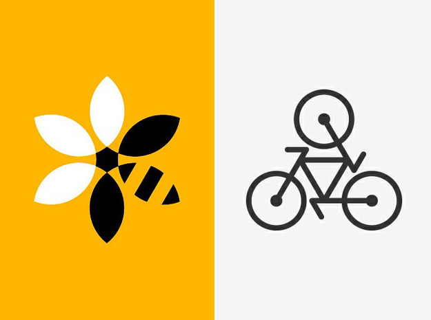
Geometric shapes.
Hidden symbolism.
Negative space.
Finding the balance of simple, function, size and precision.
Decisions, decisions! Should you have a graphic representation or symbol in your logo or not? Well that’s entirely up to you. What’s your brands signature color(s)? A color palette that you are consistent with is important for your brand to be recognized. Where will the logo primarily be used? Etc…
Do you need the help of a professional graphic designer? Your Marketing BFF can help you create a logo design that is original and uniquely showcases you/your business. Purchase a custom logo design in our shop.
*All logos shown can be referenced at: pinterest.com/marketingbff/logos
These are all outstanding logos. I especially liked the creativity of the Sushi one.
Thanks Vicki! I agree – sometimes the simplest designs can be the most creative.
Great work. Thanks. Simple design is particularly advantageous in mobile devices.
Great reminder Conrad. In this day of more and more users viewing the internet through their mobile devices, simple design definitely wins! Thx for sharing/commenting.
I find logos that make use of negative spaces, very fascinating. Using negative space to add hidden elements or message in the logo requires high level of creativity. The best example is, the pittsburgh zoo logo, which can also be classified as an optical illusion. Anyway, great post.
Great example… and totally agree! Thanks for sharing.