{Design} 3 Traits of a Great Logo
What makes a great logo? And how can you make one that not only stands out, but cultivates a loyal following?
Experts say there are at least three necessary traits:
- It must be distinct from other logos (especially competitors)
- Instantly recognizable, and
- Legible at all sizes (from billboards to mobile devices)
A memorable logo can be very simple in nature. Or it might have multiple levels of interpretation that allow us to fall in love with it over time.
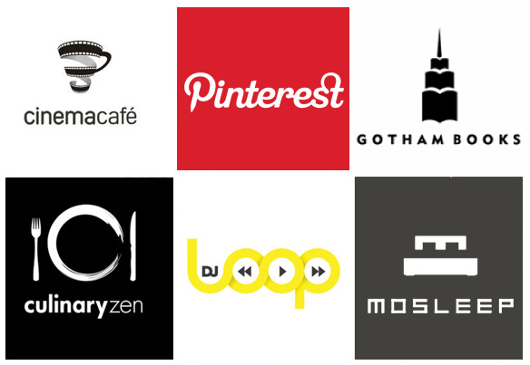
Look at the thoughtfully crafted logos above…and read the meanings and concepts that facilitated their original designs.
- Cinema Café :: this one is pretty self-explanatory. An illustration of a movie reel strip in the shape of a coffee cup.
- Pinterest :: the head of the P and its sharpened point mimic a pushpin, replicating the function of this site.
- Gotham Books :: the illustrations of a book are stacked on top of each other to simulate a skyscraper – a trademark of Gotham City.
- Culinary Zen :: a simplistic (Zen) illustration of a dinner plate setting
- DJ Loop :: a rewind, play and fast forward
- Mosleep :: an organization of doctors that deals with people having sleeping disorders. The logo, for this company is their initial ‘M’ that was also designed to look like a bed.
May these logo’s be a source of inspiration as you create the public face of your own business!

