Is your blog or website mobile friendly?
 Last week on April 21st, the Google mobile update landed, giving mobile-optimized blogs a boost in search results when the searcher is on a mobile device.
Even if you do not pay much attention to your Google rankings, this update will still affect your page traffic and audience reach.
Understanding the Google Mobile Update
Google will rank mobile websites more favorably when a user is searching on a mobile device. More and more users are using smart phones and mobile devices to fulfill their internet needs.
Pinch of Yum’s recent March traffic and income report shared their mobile vs. desktop traffic and here’s what they’ve discovered for their site:
Mobile = 47.5%
Desktop = 33.8%
Tablet/iPad = 18.6%
And based on what I’ve found, the Pinch of Yum blog is showing the ‘trend’ and why Google is forcing sites to be mobile-friendly.
Keep in mind: Your percentages might be different. My own blog traffic is currently Desktop (63.51%), Mobile (27.25%), Tablet (9.23%), but as with my own site, the percentage of mobile users accessing websites or looking for your content is only going to increase!
What is ranking?
Ranking is the position in the search results where your site shows up. For example, if I search “Your Marketing BFF” on Google (see image below), my blog is the first result to show up. (Actually, I pretty much own the entire first page of Google – and I do not pay a dime to rank high – this is due to my SEO efforts). SEO IS SO IMPORTANT TO YOUR SITE!
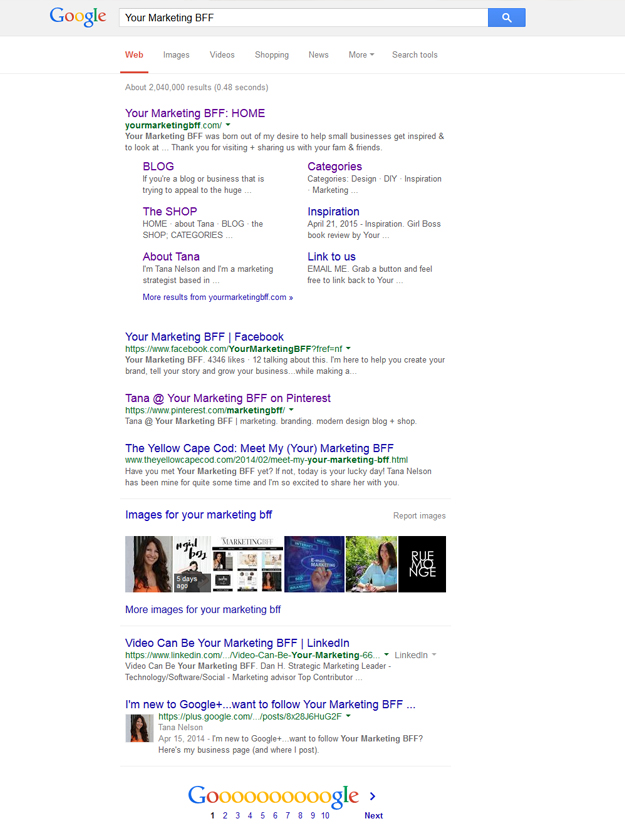
Most people searching won’t even go to the second page of the results. So if your site is not in the top 10 rankings for a keyword, it probably won’t get much traffic from that keyword or keywords.
So even if you do not watch your rankings, it is important! Read the official Google announcement for more technical info here.
Not sure if your site is mobile-friendly?
If you’d like to check your status right now:
1. Take out your smartphone and open up your web browser.
2. Go to www.google.com (you’ll need to use Google to search in order for this to work).
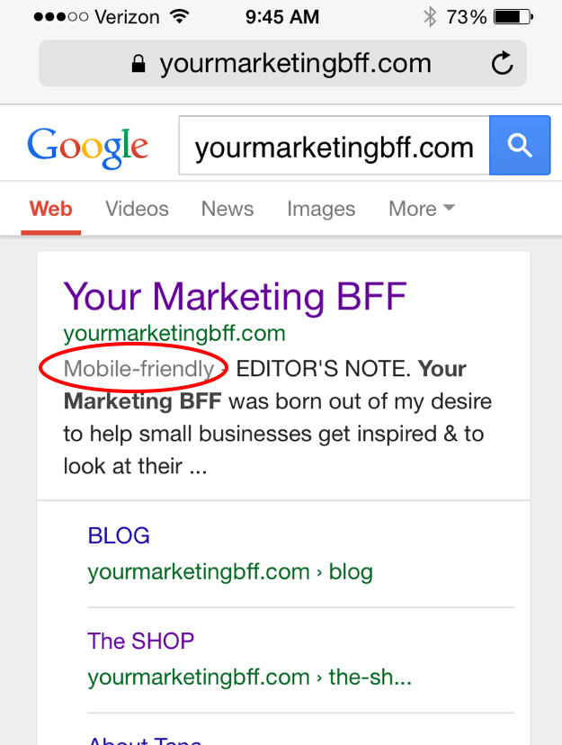
3. Enter your URL in the search bar, and find the listing for your site in the results. If your site is mobile-friendly, you’ll see a note saying so.
Here’s an example, using the Your Marketing BFF blog:
If your site is built on WordPress but not mobile-friendly, I have a secret tool I found to make it mobile-friendly ASAP – something you can totally do yourself!
A couple of weeks ago, I announced on Instagram that I would be unveiling a new site design soon – one that was mobile friendly.
My new site design has yet to be completed, but I needed a quick fix to make my existing BFF site mobile-friendly… and not lose my rankings on Google.
How to make your wordpress site mobile-friendly ASAP.
Here’s what I did to my exisiting wordpress site to make it mobile-friendly and so can you!
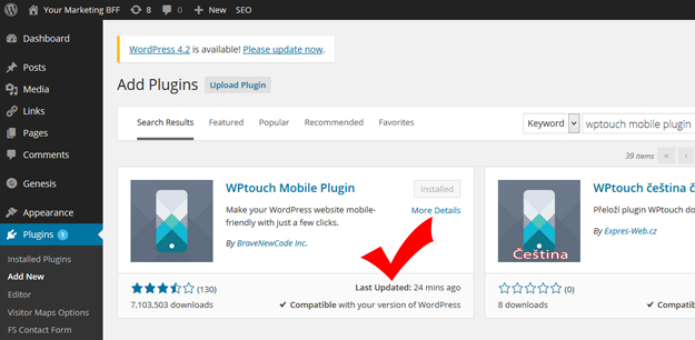
1. Go into your sites wordpress dashboard.
2. Click on Plugins and ‘add new’.
3. Type in WPtouch Mobile plugin
4. When you see WPtouch mobile plugin by Brave New Code Inc., click ‘install now’
5. Once this new plugin is installed, you’re done.
 Now, I’m going to be 100% honest, using this plugin is not ideal for all sites, but it’s good enough for right now. This is simply a quick fix so that you don’t lose your ranking on Google.
Next steps: Start looking at having your site coded correctly to be a responsive site or purchase a new responsive theme design. But in the meantime, Your Marketing BFF has your back – add the plugin and become mobile-friendly ASAP!
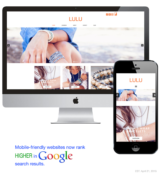
Need a new responsive theme design? Here’s our three newest responsive, mobile-friendly designs; Lulu, Zoe and Tiffany.
Cheers!